In this showcase i have collect 20 stunning example of infographics for your inspiration. Information graphics or infographics are visual representations of information, data or knowledge. So, have a look at these 20 stunning example of infographics.
[ad#co-1]
Let us know which one is your favorite? If you found any other infographics that you want to share with us,feel free to let us know by dropping in a comment.
Show Do Milhao
Where Are All the Fish?
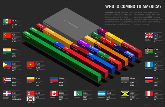
Who is Coming to America?
The Largest Bankruptcies in History
Looking for a new job, new life!!
On Driving
Great Garbage Patch
Infografias
SWiNE Flu
Trânsito 3 final (2007)
A History of Gay Marriage Bans
IL08 — Energia solare
The Most Homicidal Countries
The Death Penalty Around the World
The Magic Bean Shop and the Fries That Bind Us
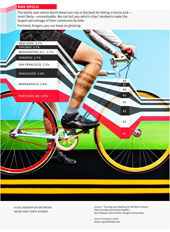
Biking to Work
Capital Gains
Seeking Refuge
Glass Half Empty: The Coming Water Wars
lessons from 2009( indian economy)
A good place to check out some awesome infographics is a website named GOOD.
if you would like to receive more inspiration from us, please consider subscribing to our feed by RSS or by email.


infoviz is the future
What perfect showcase of graphs and information design. A friend recently pointed out that a capabilities chart of mine sucked and I needed to make it more gooder. Note sure how these could help relate to my actual graph but they definitely will inspire me to try and create something at this level.
—
Thanks and Regards
Noel for Nopun.com
a graphic design studio
.-= Noel WIggins´s last blog ..For you entrepreneurs out there with pet projects in mind =-.
Cool Stuff , I love the Piggy and the Capital Gains.
I understand that alot of infographics have a great deal of information but I love those that can get across the point quickly without too much complexity. Thanks for compiling this list 😀
.-= crixandstuff´s last blog ..crixandstuff: 20 Stunning Examples of Infographics For Your Inspiration | by @ajaydesign http://bit.ly/6UfbVX via @purplehayz =-.
Great Post…! I will recommend it to my Company‘s partners…! Thanks for inspire…!
These are some fine examples of the marriage of creativity with information. Always a pleasure to look at even if you don’t really care about all the data contained in them. The balance of the elements, the color scheme, the layout, the choice of graphics – everything play out so well. This is serious inspiration. Thanks for the wonderful post.
Very Good Post! Congratulations!
Sorry, these are awful. If they turned up on my desk I’d be furious. The point of any form of graph or chart is to give a quick appreciation of the figures in a way the brain can more easily handle, most of these completely fail to do that. Some are downright misleading.
The human brain is simply not programmed to assess numbers of different sizes and shapes against one another. Nearly everyone can quickly tell which is the larger flock of birds or sheep etc. if they’re of the same size and species, almost no-one can if they’re of different sizes, and even factors such as different colours has been shown to confuse. When making an infographic, I suggest one starts with how the mind works – how it collects and stores information. There’s plenty of psyc text books on the subject, or ask any magician, they’re the real specialists in quick appreciation and storage of figures.
These may be pretty to look at, but they have absolutely no place in business of any kind, and the information they carry will be forgotten quickly or lost in the muddle. Were they to appear in a magazine they would be useful attention grabbers, but most are simply too muddled to go beyond that. Really they’re just trying far too hard to be clever. Sometimes there’s a reason things weren’t done in the past, it wasn’t that no-one thought of it, they did, they just realised it was a very bad idea.
I really like the first one, Show Do Milhao. Information is so much easier to digest when presented in a visual form.
Another good one is Flush Your Credit. It’s a good visualization of what happens when you stop paying your credit card bills.
.-= Ashley´s last blog ..Does Facebook Hurt Your Credit? =-.
These are more works of art than actual helpful infographics. enjoy looking at them but would be hard pressed to get the information quickly. Still, nice design. Here are some more infographics – Found another site call Infographics Showcase
.-= Graphics Guy´s last blog ..Can I Afford an iPad? =-.
i like how information can be personalized to such degree! its so easy to understand things this way and it encourages you to learn too. great examples!
Thank you for sharing this, it is a very inspirational material, thank you.
It is very interesting topic you’ve written here..The truth I’m not related to this, but I think is a good opportunity to learn more about it… And as well talk about a different topic to which I used to talk with others..
Hi, Neat post. There’s an issue together with your site in web explorer, might test this? IE still is the market chief and a huge portion of folks will omit your excellent writing because of this problem.
.-= zlato´s last 1 ..1 =-.