CSS3 is really starting to gather momentum with many of the commands outlined in the CSS3 working draft supported by Firefox, Safari and Google Chrome. We thought we’d put together some of our favourites. Before we get started CSS3 commands require browser specific syntax for them to work.
[ad#co-2]
For Mozilla Firefox we need to use the -moz- prefix, for example:
-moz-border-radius:
And for Safari the -webkit- prefix, for example:
-webkit-border-radius:
1. Border radius
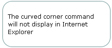
The CSS3 border radius command creates curved corners on an element. Instead of using 4 or more images to create curved corners use the following commands:
The curved corner command will not display in Internet Explorer
#box1 {

border: 1px solid #699;
/* for Mozilla Firefox */
-moz-border-radius: 20px;
/* for Safari & Google Chrome */
-webkit-border-radius: 20px;
}
2. Box shadow
A shadow can be applied to elements using the CSS3 box shadow command. The box shadow accepts three numeric values plus a colour to apply this effect. These numbers are:
1. Distance of horizontal offset of shadow – A positive value means the shadow will cast to the right and a negative value to the left
2. Distance of vertical offset of shadow – A positive value means the shadow will cast below and a negative value above
3. How blurry you’d like the shadow
With the addition of a colour value the shadow is complete:

#box2 {

/* Not mandatory for the box shadow effect */

border:1px solid #699;x
/* for Mozilla Firefox */
-moz-box-shadow: 5px 5px 5px #b6ebf7;
/* for Safari & Google Chrome */
-webkit-box-shadow: 5x 5px 5px #b6ebf7;
3. Transparency or RGBA
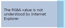
Transparency has always been tricky. Different browsers historically have applied transparency using different commands. Continuing this cross-browser inconsistency we have the addition of the new CSS3 RGBA background property, however in principle this command is more logical. The command consists of 4 values – the first, second and third are the red, green & blue values (0-255) respectively followed by the alpha channel or transparency (0-1).
For the RGBA command the browser specific prefixes (-moz-, -webkit-) aren’t required:
#box3 {
background-color: rgba(110, 142, 185, .5);
}
The background colour command adds a nice blue-grey background at .5 or 50% opacity in browsers that understand the CSS3 RGBA property.
Unfortunately Internet Explorer will also attempt to render the background colour command but not understand RGBA. To ensure that the background colour is also set in IE an IE-only hack is required. In the following example the :last-child psuedo selector which Internet Explorer doesn’t understand is used to exclude it.
#box3 {

/* For all browsers */

background-color: #6e8eb9;

}
body:last-child #box3 {
/* Exclude all IE browsers using :last-child */
background-color: rgba(110, 142, 185, .5)!important;
}
4. Columns
The ability to add columns has been added to CSS3. Rather than floating elements within containers we can set the column number, width and rule:
![]()
#box4 {

/* Not mandatory for the column property */

border: 1px solid #699;
/* for Mozilla Firefox */
-moz-column-count: 2;
-moz-column-gap: 20px;
-moz-column-rule: 1px solid #6e8eb9;
/* for Safari & Google Chrome */
-webkit-column-count: 2;
-webkit-column-gap: 20px;
-webkit-column-rule: 1px solid #6e8eb9;
}
5. Multiple background images
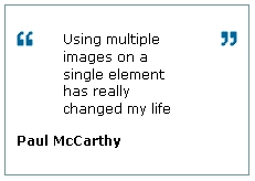
Background imagery has always been restrictive when it comes to CSS due to the fact you can only apply one background image per element. This isn’t the case with CSS3 which allows multiple images per element by simply comma-separating them.
To place an image on both the left and right of an element you can use the following commands, with a little styling:
#box5 blockquote{

background:url(/i/quotel.gif) no-repeat 0 0, url(/i/quoter.gif) no-repeat 100% 0;

border:1px solid #699;
padding:0 20px;
}
This command will be mis-rendered by Internet Explorer as it doesn’t accept 2 background images on a single element. An exclude all IE hack is required.
#box5 blockquote {
/* For all browsers, just an open quote */
background: url(/i/quotel.gif) 0 0 no-repeat;
padding: 0 20px;
}
body:last-child #box5 blockquote{
/* Exclude all IE browsers using :last-child */
/* Then the two images */
background: url(/i/quotel.gif) no-repeat 0 0, url(/i/quoter.gif) no-repeat 100% 0;
}
6. Background gradients
CSS3 background gradients are extremely flexible and can be used to create complex patterns. At its simplest the CSS linear gradient allows a gradient to be applied to an element from top to bottom and left to right.
This example of a CSS3 gradient in Mozilla Firefox applies a light blue gradient at the bottom of a box for just 20% of the boxes’ height

#box8 {

/* for Mozilla Firefox */

background: -moz-linear-gradient(bottom, #b6ebf7, #fff 20%);

}
Safari uses a less intuitive but more flexible approach using colour stop values. An example of the Safari specific code follows (note the linear is included in brackets instead of outside):
#box8 {
background: -webkit-gradient(linear, left bottom, left top, color-stop(0, #b6ebf7), color-stop(0.20, #fff));
}
7. Rotation
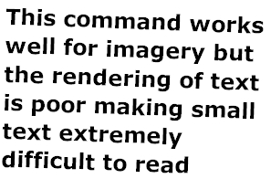
CSS3 also allows rotation of elements using the transform command, with the rotate property accepting degrees as a parameter.
<code>#box9 {
-moz-transform: rotate(2deg);
-webkit-transform: rotate(2deg);
}</code>
8. Outlines
Outilines are included in the CSS3 specification and allow both a border and an outline to be applied to a single element.
The outline property is identical to the border command. The additional offset property however allows the border to be moved further inside or outside of the element.
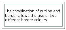
#box7 {

border: 1px solid #000;

outline: 1px solid #699;

outline-offset: -9px;

}

Nice post… keep it up
Excellent .I really like ” Box shadow” technique.Good job.
….and fot the Internet Explorer you have to use neither -moz nor -webkit!!!!!
I think Rotation property is the best CSS3 offering, it really make us a bit relax.
Good…. i like
This was a really helpful post. I appreciate your postings . Thanks for sharing
I really like it and it is very useful
Great information thanks. I did not expect that again i see another good information,many thanks againWEB DESIGN